Creating a Custom Theme
Mango's UI is built on Angular Material, which uses a theming system based on Material Design color palettes. You can customize the appearance of the entire application by selecting different color palettes or creating your own custom palettes that match your brand identity.
The User Theme
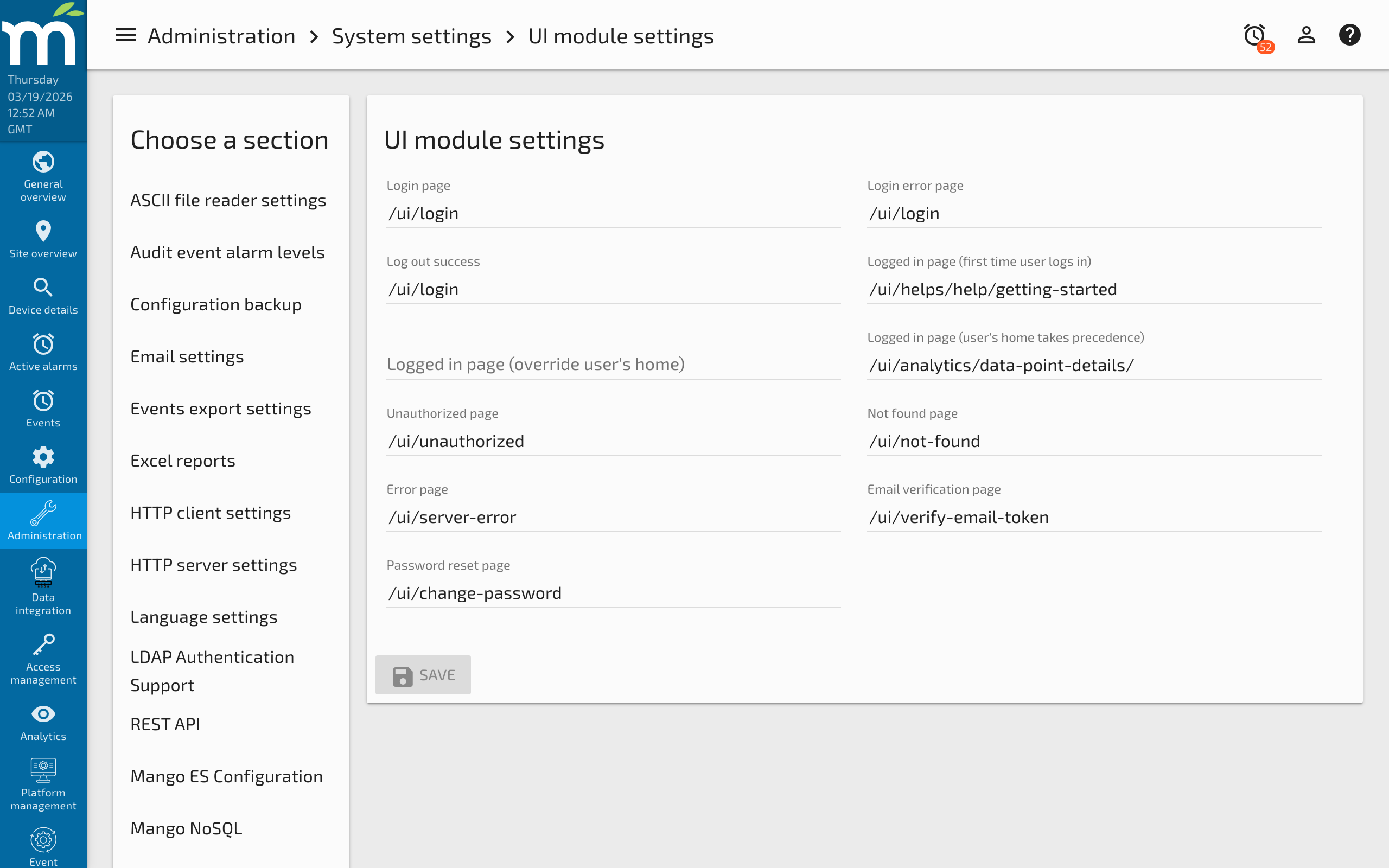
The Administration > UI Settings page is where you set options related to the UI, including theme selection. You can select the userTheme option in the Choose theme dropdown, then choose from the 20 Material Design color palettes for use within the Mango UI.
Per the Material Design Color Spec, you choose one color palette for each of the three color intentions plus one for the background:
| Color Intention | Purpose | Example Usage |
|---|---|---|
| Primary palette | Represents primary interface elements. | Toolbar, sidebar header, primary buttons, active tabs. |
| Accent palette | Represents secondary interface elements. | FAB buttons, selection controls, links, secondary buttons. |
| Warning palette | Represents elements that require caution. | Delete buttons, error messages, destructive actions. |
| Background palette | Sets the overall background colors. | Page background, card backgrounds, dialog backgrounds. |
Using the built-in palette selector, you are limited to the predefined Material Design color shades. For deeper customization -- such as specifying an exact brand color or choosing a specific shade -- you need to create a custom palette.
Creating a Custom Color Palette
To create a custom palette with your exact brand colors, you modify the UI Settings JSON store.
Step 1: Generate Your Palette
Use a Material palette generator to create a complete palette from your base color. Enter your brand color (which will be used as shade 500), and the generator creates all the required shade variations (50 through 900, plus A100 through A700).
Click the copy icon in the generator and grab the JavaScript object containing the colors.
Step 2: Add the Palette to the JSON Store
- Navigate to Administration > JSON store in the Mango UI.
- Click the edit icon next to the UI Settings entry, or navigate directly to
/ui/administration/json-store-editor/mangoUI-settings. - Add a
palettesentry to the existing JSON. Note that you need to convert single quotes to double quotes for valid JSON.
{
    "palettes": {
        "customBurntOrange": {
            "50": "fdf3eb",
            "100": "fae1cd",
            "200": "f7cdac",
            "300": "f3b88a",
            "400": "f1a971",
            "500": "ee9a58",
            "600": "ec9250",
            "700": "e98847",
            "800": "e77e3d",
            "900": "e26c2d",
            "A100": "ffffff",
            "A200": "fff5f0",
            "A400": "ffd2bd",
            "A700": "ffc1a3",
            "contrastDefaultColor": "light",
            "contrastDarkColors": "50 100 200 300 A100"
        }
    }
}
Understanding Palette Shades
Each palette must include the full range of color shades:
| Shade | Purpose |
|---|---|
| 50 | Lightest shade, used for backgrounds and hover states. |
| 100-300 | Light shades for large surfaces and subtle accents. |
| 400 | Used for some hover and focus states. |
| 500 | The primary shade -- this is your base brand color. |
| 600-700 | Slightly darker shades used for active states. |
| 800-900 | Darkest shades used for status bars and dark surfaces. |
| A100-A700 | Accent shades used for focused elements and emphasis. |
| contrastDefaultColor | Text color for dark background shades (light for white text, dark for black text). |
| contrastDarkColors | Space-separated list of shades that should use dark text instead of the default. |
Step 3: Apply the Custom Palette
- Save the JSON store entry.
- Navigate to the UI Settings page (Administration > UI Settings) and refresh your browser (F5).
- Select userTheme from the Choose theme dropdown.
- Your custom palette will now appear in the palette dropdown lists alongside the built-in Material Design palettes.
- Select your custom palette for the Primary, Accent, Warning, or Background palette as desired.
Creating Multiple Custom Palettes
You can define multiple custom palettes in the JSON store by adding additional entries to the palettes object:
{
    "palettes": {
        "brandPrimary": {
            "50": "e3f2fd",
            "500": "1565c0",
            "900": "0d47a1",
            "contrastDefaultColor": "light",
            "contrastDarkColors": "50 100 200"
        },
        "brandAccent": {
            "50": "fff3e0",
            "500": "ff6d00",
            "900": "bf360c",
            "contrastDefaultColor": "light",
            "contrastDarkColors": "50 100 200"
        }
    }
}
Tips for Theme Design
- Test with real data -- View your themed UI on pages with actual data to make sure text remains readable against the new background colors.
- Check contrast ratios -- Ensure that text colors (light/dark) provide sufficient contrast against each shade. The WCAG guidelines recommend a minimum contrast ratio of 4.5:1 for normal text.
- Use the accent palette sparingly -- The accent color should draw attention to important interactive elements, not overwhelm the interface.
- Consider dark themes -- You can create a dark background palette and combine it with lighter primary and accent palettes for a dark-mode appearance.
Related Pages
- Custom CSS Styles — Apply additional CSS customizations beyond the theme palette
- Introduction to HTML5 Web Apps — Architecture overview of the Angular Material framework used for theming
- UI Development Process — Frontend development workflow and code style guidelines