Dashboard Designer - Basic Usage
The Dashboard Designer is a drag-and-drop page creation tool. Under the hood, the same HTML components used in custom pages are generated, but with the Dashboard Designer you can position components with your mouse and keyboard and visually set attributes through property panels.
Page Controls
The Dashboard Designer can be found under Administration > Dashboard Designer in the menu. At the top of the page are the same controls used on the Page Editor.
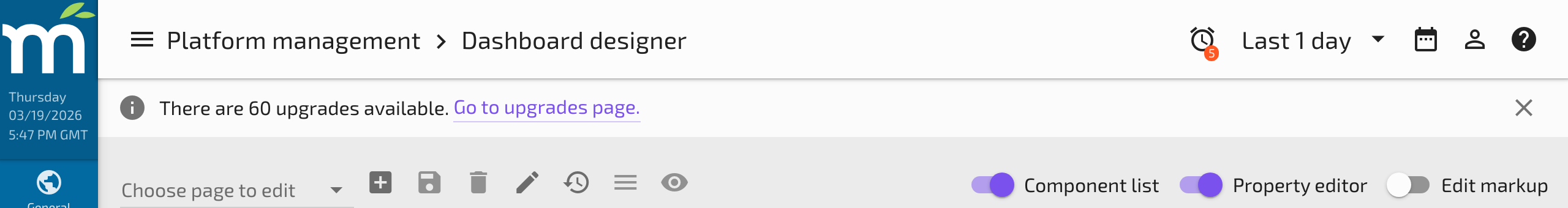
The dropdown to the left of the icon buttons lets you choose an existing page to edit. The New page button sets up a blank page for you to work with. The Save button saves your changes to the page you are currently editing. Before you can save a new page, you will need to give it a Page name. The Delete button removes a page from the system after confirming.
Be sure to Save changes to your page often. You can use the keyboard shortcut Ctrl/Cmd+S to quickly save without leaving the keyboard.
The Edit name and permissions button opens the controls for editing page properties. Read / Edit Permissions can be used to prevent access to a page based on user permissions. Page name can be updated independently of the page's menu item and URL.
Component Libraries
All components -- whether they are Mango Components, Material Design Components, or standard HTML Elements -- are displayed in expandable containers on the left side of the page.
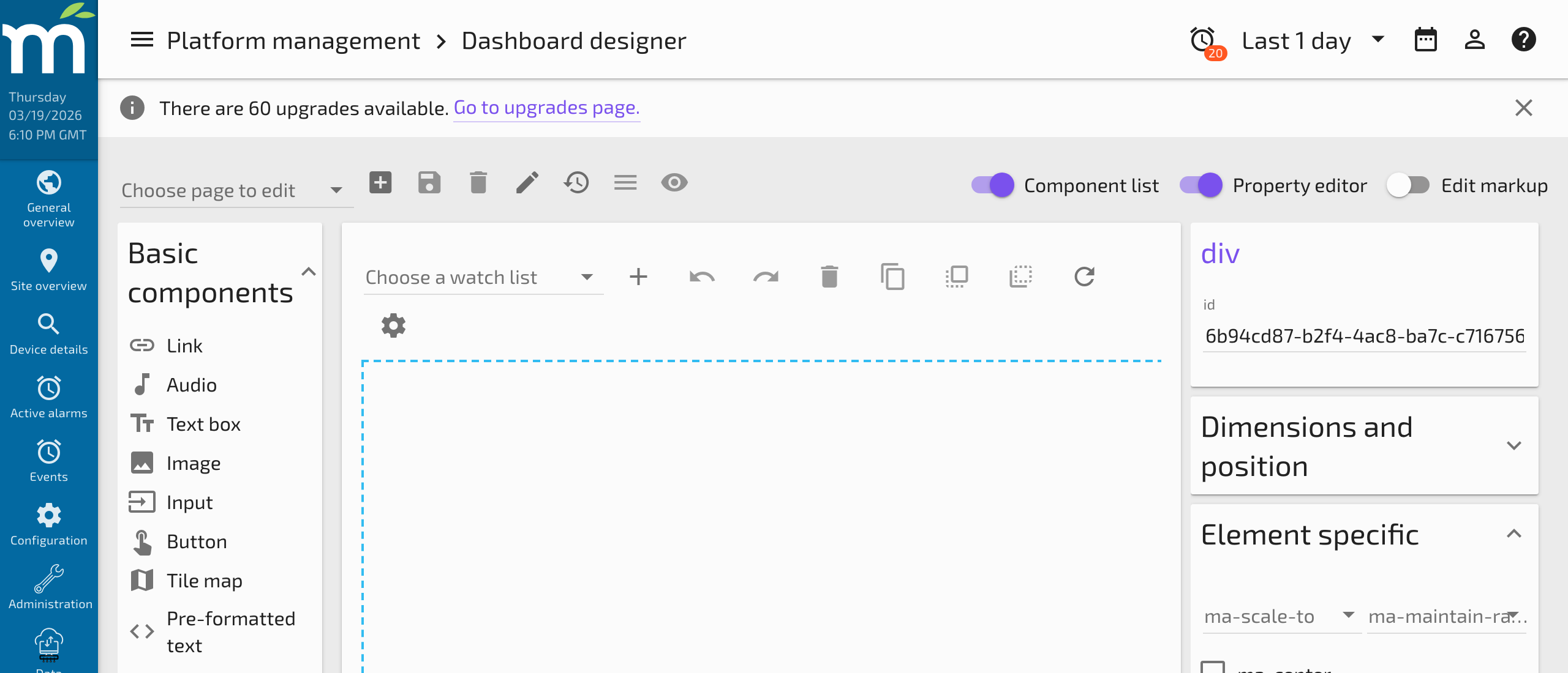
Expanding one of these containers shows you components that you can drag and drop onto the Dashboard Designer canvas. Mango components have been organized into category groups:
| Category | Example Components |
|---|---|
| Point Values | <ma-point-value>, <ma-get-point-value>, <ma-set-point-value> |
| Charts | <ma-serial-chart>, <ma-pie-chart>, <ma-gauge-chart> |
| Date/Time | <ma-date-picker>, <ma-date-range-picker> |
| Tables | <ma-point-value-table>, <ma-events-table> |
| Images | <ma-switch-img>, <img> |
| Containers | <div>, <md-card>, <md-content> |
| Buttons | <md-button>, <ma-button> |
Dragging any of these components onto the canvas adds it to the page. Items snap into place and align along a 10px grid.
Canvas Controls
Above the Dashboard Designer canvas are icons that allow you to Undo/Redo, Delete Selected Elements, Duplicate Selected Elements, Move Elements Forward/Backward, and Refresh the canvas. A Choose a watch list dropdown is used for creating dynamic dashboards (see Dynamic Dashboard Workflow).
Elements on the canvas can be nudged one pixel at a time using the Up/Down/Left/Right keyboard arrow keys.
Keyboard Shortcuts
| Shortcut | Action |
|---|---|
| Ctrl/Cmd+S | Save |
| Ctrl/Cmd+Z | Undo |
| Ctrl/Cmd+Y | Redo |
| Ctrl/Cmd+A | Select All Elements |
| Ctrl/Cmd+Click | Add element to selection |
| Ctrl/Cmd+C | Duplicate Selected Elements |
| Ctrl/Cmd+PgUp | Move Elements Forward (higher z-index) |
| Ctrl/Cmd+PgDown | Move Elements Backward (lower z-index) |
| Delete | Delete Selected Elements |
| Arrow Keys | Nudge selected elements by 1px |
Attribute Inputs
On the right side of the page are expandable containers for setting attributes on selected elements.
Help Icon
If you have a Mango Component selected, you will see a Help Icon next to its title. Clicking this opens the API Docs for that component, showing how to use its attributes with detailed descriptions and examples.
Dimensions and Position
Expanding the Dimensions and Position container shows HTML attributes for positioning your elements. Notice how the Left and Top attributes update as you move an element on the canvas. You can also manually enter exact pixel values for precise positioning.
Element Specific Attributes
The Element Specific container shows attributes unique to the selected element. For example, an <img> element shows a src attribute, while a <ma-point-value> shows attributes like point-xid, label, and display-type. For more information on component-specific attributes, click the Help Icon to see the API documentation.
AngularJS Attributes
AngularJS Attributes are shown in their own container. Use these to:
ng-show/ng-hide-- Conditionally show or hide elements based on a data point value or expression.ng-class-- Apply CSS classes dynamically based on conditions.ng-style-- Set inline styles dynamically based on data point values (see Styling with Data).ng-click-- Trigger user interactions such as navigating to another page or setting a point value.
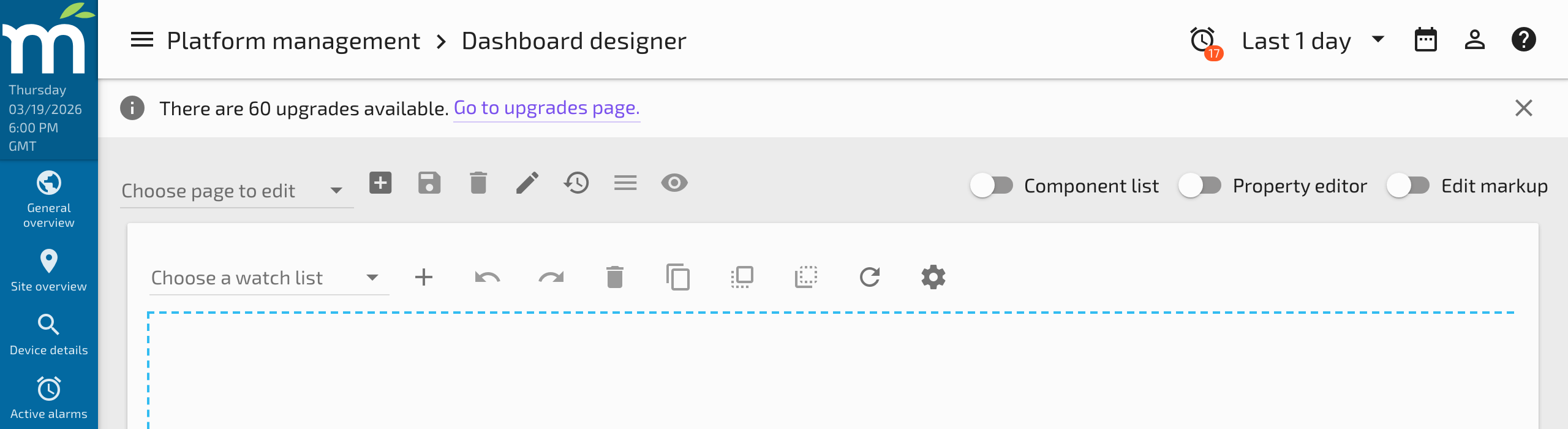
Hiding the Panels
The Component List and Property editor toggles can be used to hide the panels, giving more room for viewing the Dashboard Designer canvas. This is useful when you need to see more of your layout during design.
Code View
A third toggle switch labeled Edit markup allows you to hide the canvas and panels and display the HTML Code View of the page.
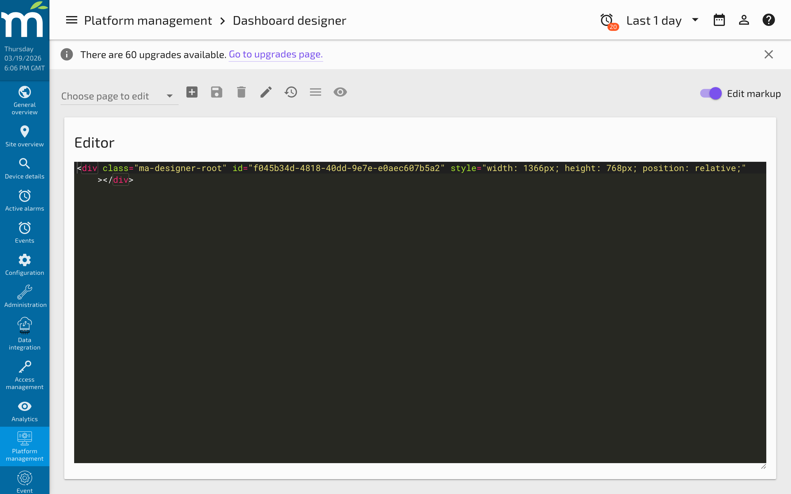
This shows that the Dashboard Designer simply generates semantic HTML code. Opening the Code View is useful for:
- Learning how components work -- See the exact HTML attributes and structure generated by the visual editor.
- Fine-tuning layout -- Make precise edits to HTML, CSS, or AngularJS attributes that are easier to type than configure visually.
- Copy and paste -- Copy the markup to a new page, a different Mango system, or the Page Editor for further development.
- Debugging -- Identify issues in the generated markup when a component is not behaving as expected.
Related Pages
- Dynamic Dashboard Workflow — Build dashboards that update based on user selections
- Enabling Auto Scale — Scale dashboard pages to fit any screen size
- Custom Pages — Alternative approach using the code editor for full HTML control
- Pipes Demo — Example of building a pipe visualization with the Dashboard Designer